Smartbox
Brand development
Smartbox, a pioneering assistive technology company for individuals with disabilities or non-communicative needs, had successfully carried its brand and identity for about five years. However, with a swift expansion in staff, a venture into international markets, and the acquisition of additional companies to within the group, Smartbox recognised the need for more robust and comprehensive brand and identity guidelines.
In our initial discussions, we delved into the strategic utilisation of design and brand elements to seamlessly integrate new organisations into the existing framework. We explored various brand architecture and hierarchy models, considering how individual identity elements could be harmoniously adopted by each brand within the expanding Smartbox group.

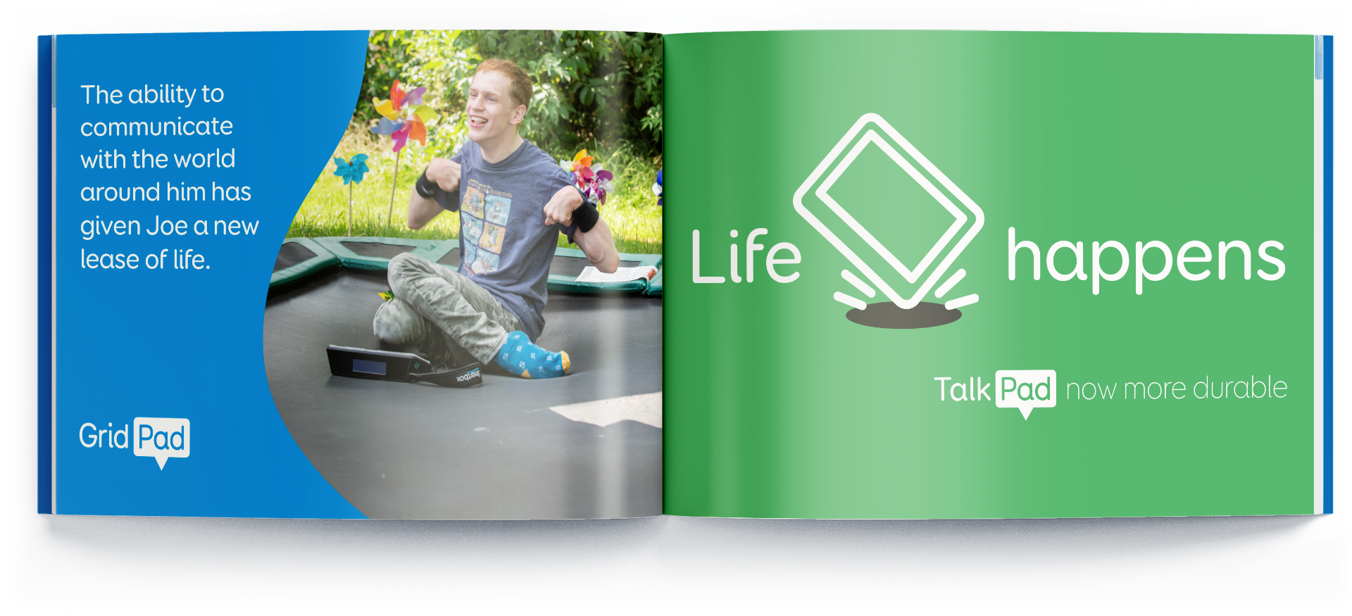
A smiling person sitting on a trampoline surrounded by colorful pinwheels, alongside an ad for Grid Pad. Text on the left reads: 'The ability to communicate with the world around him has given Joe a new lease of life.' Right side features 'Life happens' with 'Talk Pad now more durable' against a green background.
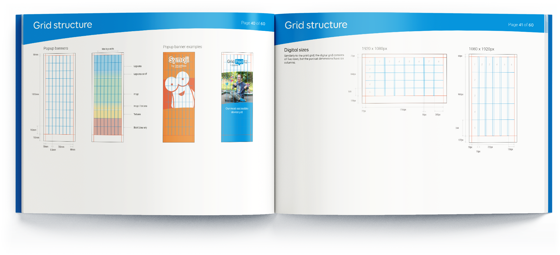
Expanding upon the foundational 20-odd-page brand guidelines that covered the basics such as logos, fonts, and colours, we meticulously crafted a comprehensive 60+ page document. This extended guide not only delves into the fundamental brand elements but also spells out the nuanced details, including naming conventions, icon design, photography styling, and even page layout grid structure.

Open design guidelines booklet displaying logo variations and usage rules for 'Smartbox'. Includes color variants, safe space instructions, and improper usage examples with marked errors. Features blue and white design theme, page numbers 10 and 11 out of 60.

Open book displaying branding guidelines for Smartbox, featuring horizontal and vertical logo arrangements with partner logos like CareTech and REHAVISTA.

A set of 18 icons representing various concepts: heart, teamwork, superhero, wheelchair user with flag, diamond in water, dashboard, user interfaces, computer mouse, click action, refresh arrow, question gear, text and speech bubbles, multimedia, language translation, book and image, cloud download.

Icon of a hand with an extended index finger, highlighted blue, surrounded by grid lines and concentric circles.

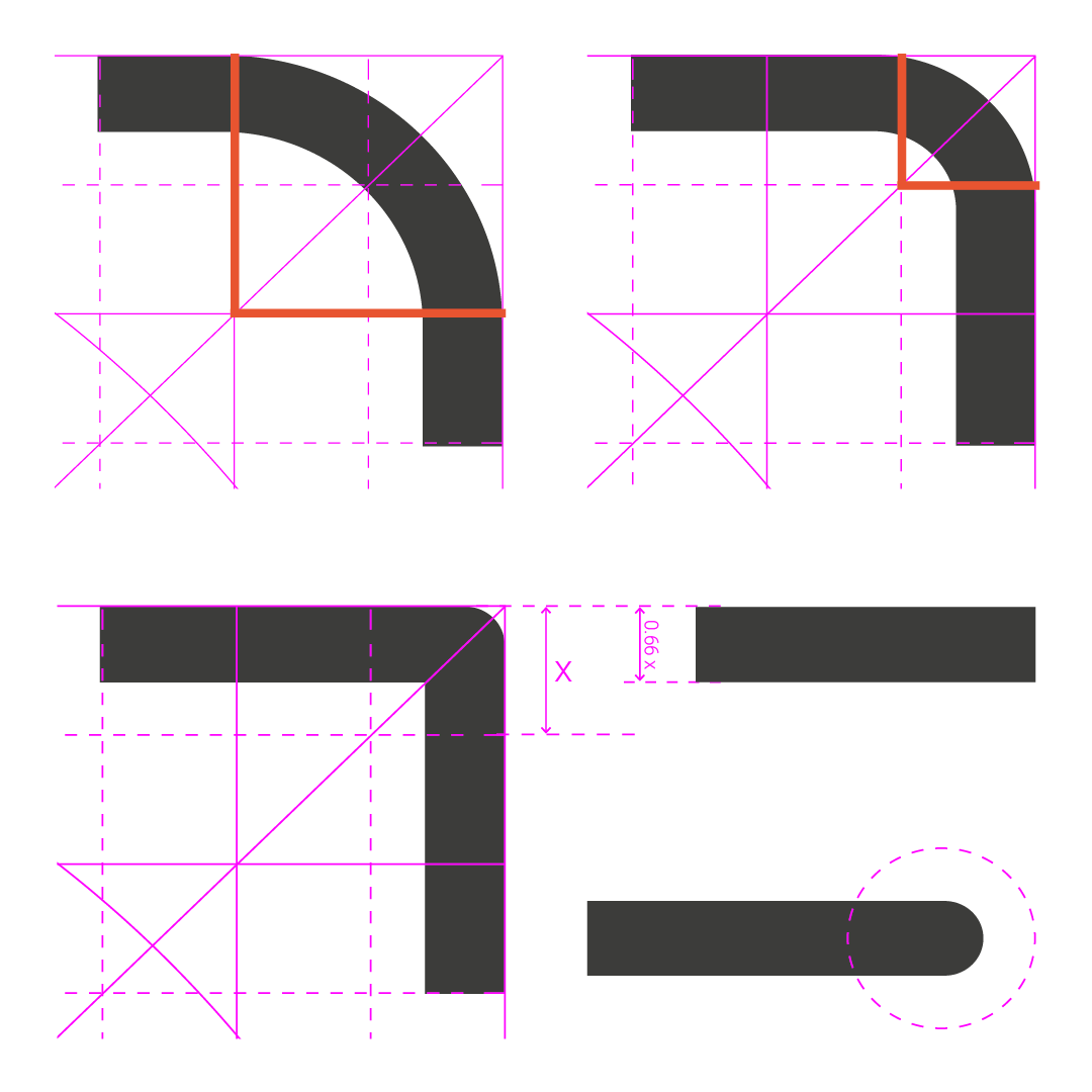
Diagram illustrating different quarter-circle and rounded corner shapes with grid and measurement lines in pink and orange.

Open magazine showcasing photography tips with images of people using technology devices. Left page includes photos showing photography style with individuals interacting with devices. Right page focuses on product photography for hardware and software, displaying different screen interfaces and devices.

Book pages showing grid structure designs for popup banners and digital sizes with measurements and examples.
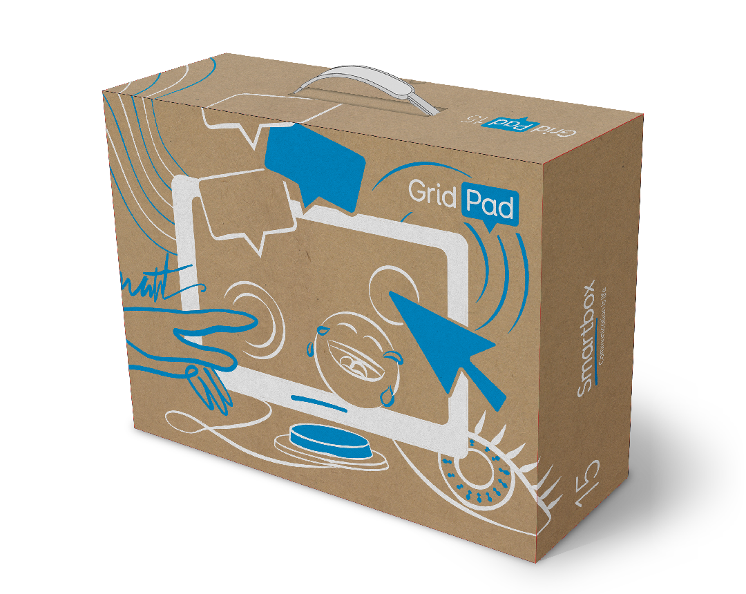
During the project’s final stage, we explored tablet packaging options. Guided Smartbox’s new motto, ‘communication is life’, each box celebrates connectivity while showcasing the device’s capabilities. For example, the TalkPad packaging illustrates its touch or button functionalities.

Grid Pad packaging box with illustrations and branding

A cardboard box labeled "Talk Pad" with an abstract design featuring a hand, speech bubbles, and hearts, suggesting communication and technology themes.
Keep exploring…
Get in touch
If our journey resonates with you and you find yourself in need of guidance, we're here to assist. Reach out to us, and let's discuss how we can help you reach your destination.

