
Corrigan
Corrigan Accountants, Rebrand
Corrigan, a burgeoning Bristol-based accountancy firm, approached us seeking assistance in elevating their brand and identity within an over saturated and fiercely competitive market.
With a notable presence in the tech, start-up, and charity sectors, we strategically positioned them as ‘enablers for the brightest organisations to support their communities’. The bold identity we crafted unequivocally echoed this sentiment.

Corporate stationery set with letterhead, envelope, and compliment slip, featuring orange circular design and "Corrigan" branding.

Two business cards. The left card is light gray, featuring text: "Edward Corrigan, Managing Partner" with a phone number and email address. The right card is black, with the name "Corrigan" at the top and an orange arc at the bottom.

Six financial and business-themed book covers with simple icons, including a magnifying glass, pie chart, flower, laboratory flask, chess piece, and report graphic. Each cover has the title "Corrigan" on top and the company name along with a project name beneath each icon. The background colors alternate between light gray and black.
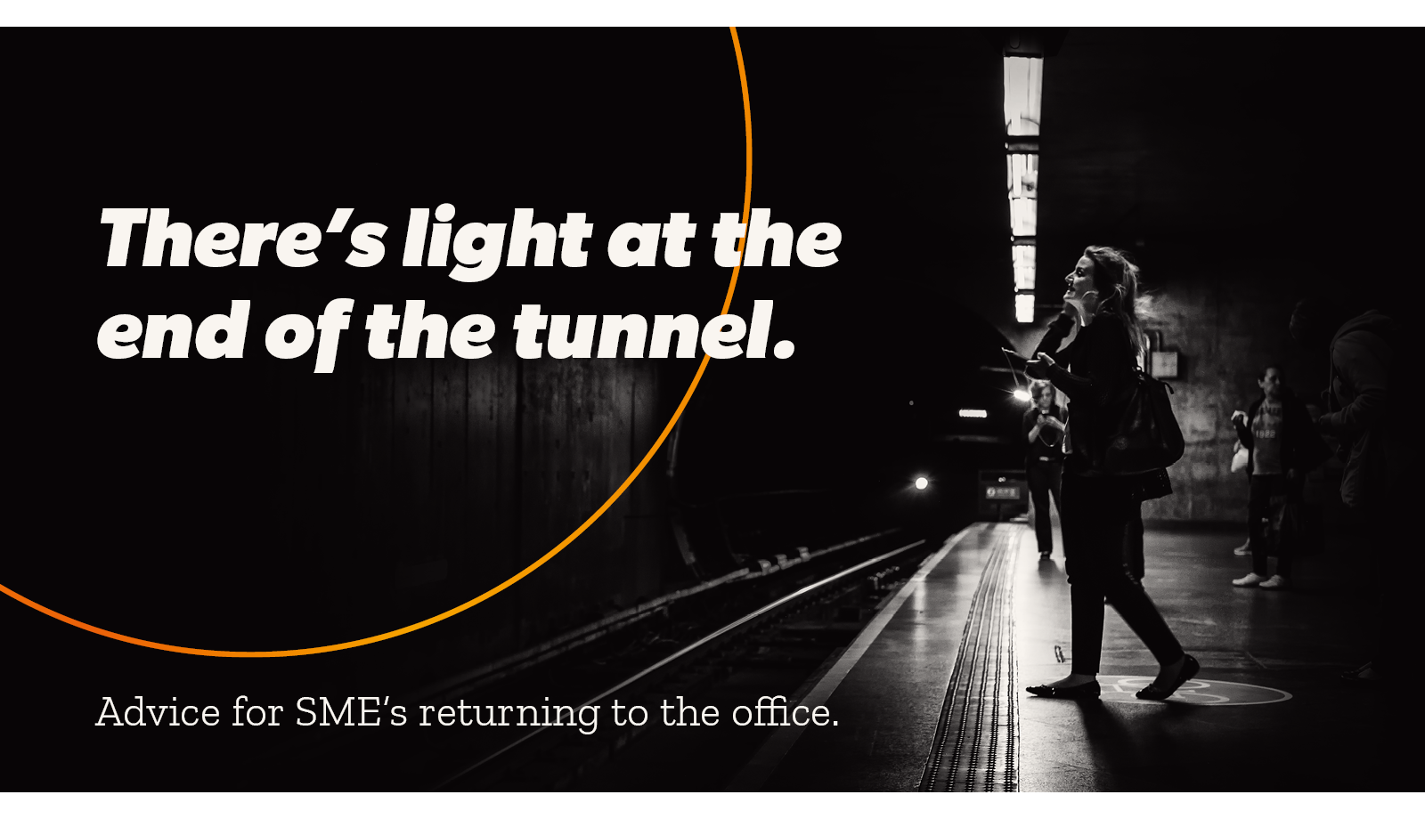
Black and white image of people waiting on a subway platform. Text reads "There’s light at the end of the tunnel." and "Advice for SMEs returning to the office."
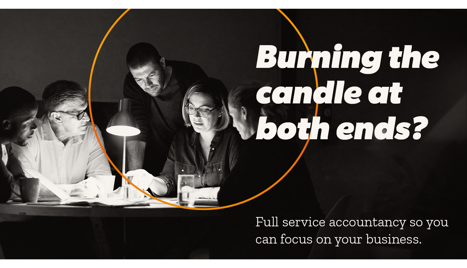
Group of people working late around a table with a lamp, accompanied by text 'Burning the candle at both ends?' and 'Full service accountancy so you can focus on your business.'
To enrich the brand identity and strengthen the brand message, we gave Corrigan a brand language centered around light — incorporating common idioms and words with dual meanings related to brightness, light sources, or synonymous concepts.
In order to provide flexibility in their marketing endeavours, we curated a suite of neon colour gradients (including shades of pinks, blues, and greens) — coupled with a diverse array of examples showcasing different applications, thereby enabling customization to resonate with varying messages and audiences.

Three smartphone screens with advertisements. First screen: 'Xero accounting for SME webinar' with a hand holding a phone displaying financial app data. Second screen: 'Saving for not just your future?' with a pink piggy bank. Third screen: 'Have an idea? Not sure what help is available?' with a light bulb on an orange background. Event and session details provided at the bottom of each screen.

Set of 16 black and orange line icons representing various concepts such as technology, ideas, growth, awards, travel, finance, and analysis.
With each sector depicted through photography, we employed pictograms to delineate the range of services offered by Corrigan. These encompassed accountancy software solutions, risk assessments, international accounting, mergers and acquisitions, as well as income tax and VAT services.
The culmination of our brand efforts manifested in a new website for Corrigan. With a rich history and a diverse clientele, we structured the website around engaging case studies — a departure from the norm within the Accounting industry.
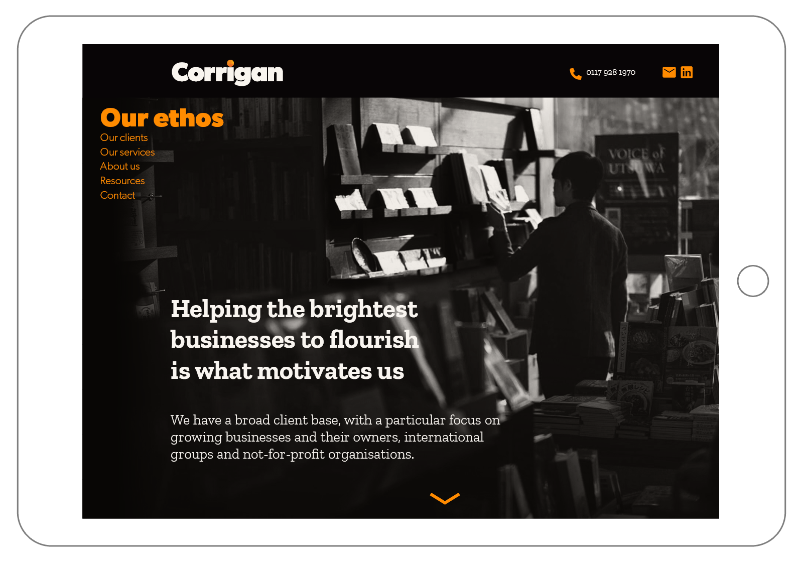
Website screenshot featuring "Corrigan" branding and a header "Our ethos." A person browsing books in a store is visible in the background. The text discusses helping businesses to flourish, focusing on growing businesses, international groups, and non-profits.

Person presenting a profitability data chart on a screen with colorful graphs and text, indicating revenue percentage of support costs, in a business setting.
Keep exploring…

Get in touch
If our journey resonates with you and you find yourself in need of guidance, we're here to assist. Reach out to us, and let's discuss how we can help you reach your destination.