
Invica
Brand design

The Invica Group, an independent acquisitions company, operates within industrial, technological, and consumer markets focusing on fuels, filtration, and infrastructures.
Our challenge was to develop a brand identity for this new holdings company, emphasizing their commitment to building sustainable value rather than perpetuating the predatory reputation often associated with such enterprises.
We chose the mathematical symbol ‘∀’, meaning ‘for all’, as it aptly represents Invica’s overarching mission. The negative space within this turned ‘A’ creates a torch motif, serving as the cornerstone for the rest of the identity's graphics.
Invica logo with red triangle design
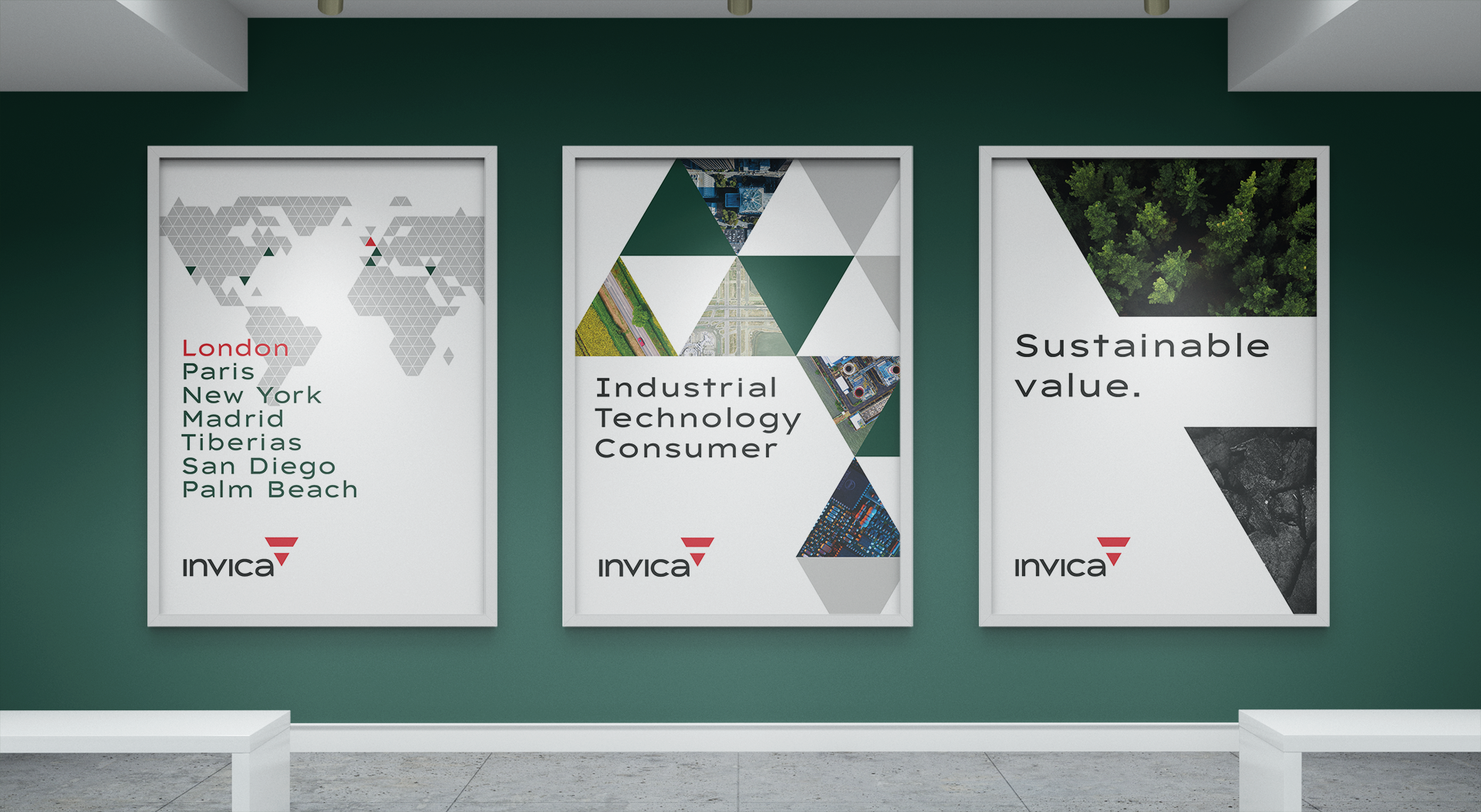
Three posters on a green wall. Left poster lists cities: London, Paris, New York, Madrid, Tiberias, San Diego, Palm Beach with world map. Center poster reads 'Industrial Technology Consumer' with geometric shapes and aerial images. Right poster says 'Sustainable value.' with forest and rock images. All posters display the Invica logo.

Corporate stationery set with Invica branding including business cards, letterhead, and envelope in green and white design.
Business professionals in a conference room presenting risk-return dynamics analysis on a screen. A woman in a white suit is speaking, and a man in a suit is holding a tablet. Four seated individuals are partially visible in the foreground.
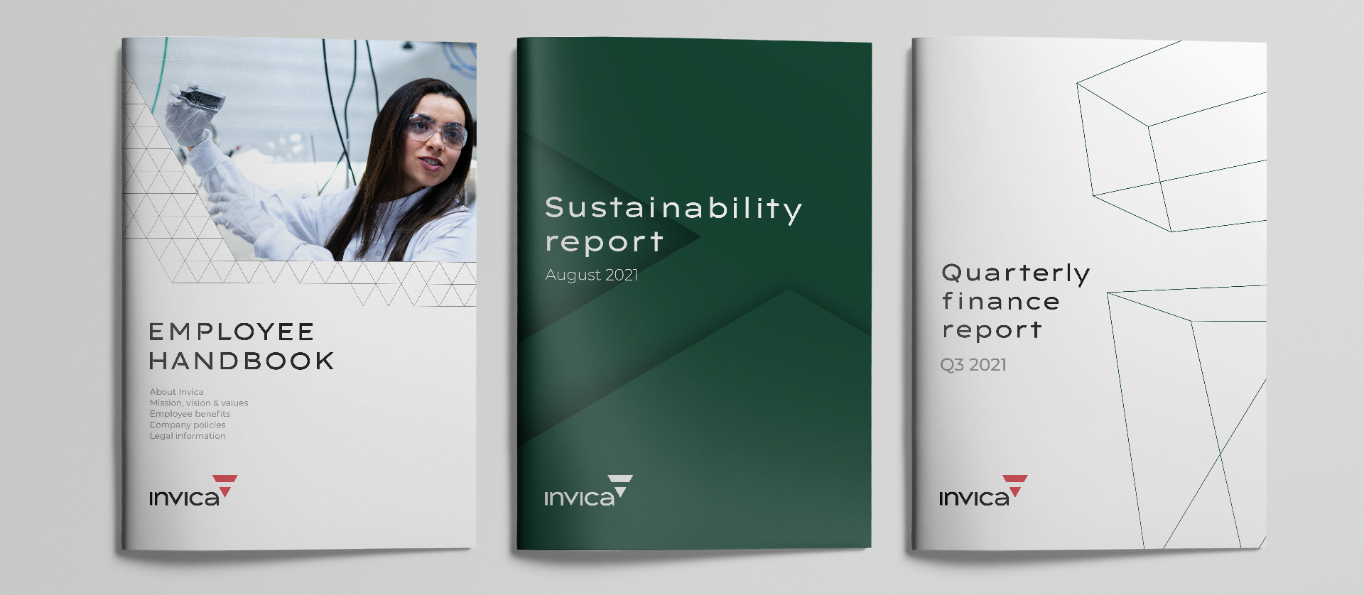
Three documents are displayed: an 'Employee Handbook' with an image of a person in a lab setting, a 'Sustainability Report' dated August 2021, and a 'Quarterly Finance Report' for Q3 2021. All documents feature the Invica logo.
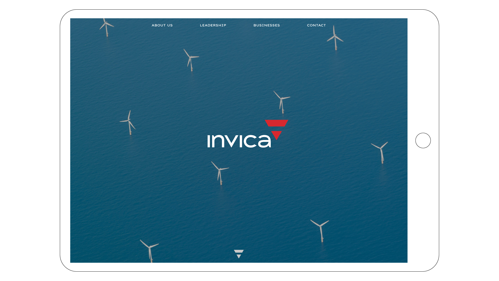
Tablet screen displaying a website with a blue ocean background featuring wind turbines. The word 'invica' and navigation links like 'About Us,' 'Leadership,' 'Businesses,' and 'Contact' are visible.
Keep exploring…

Get in touch
If our journey resonates with you and you find yourself in need of guidance, we're here to assist. Reach out to us, and let's discuss how we can help you reach your destination.